Showing posts with label photography. Show all posts

Wednesday, May 13, 2020

Siege - Days 57 and 58

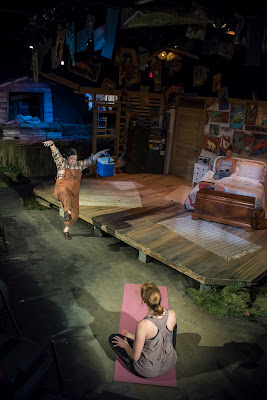
More progress on Alice (the book not some girl).  The photographer,  Jordan Fraker, has agreed to let me use his photos in the Case Study chapter about Kitchen Dog Theater's production of Alabaster!

Woohoo!

(That's me woohooing in the photo...not.
Actually KDT Ao-Artistic Director Tina Parker as Weezy the goat.)

Alabaster at Kitchen Dog Theater - photo by Jordan Fraker


The last couple days have been filled with little concerns: research on a new computer and can-I-finally-afford-a-pen-display (not yet).  Banking.  Laundry.  Today's lunch will be yet another architectural continuing education Zoom meeting etc. etc. etc.


Wednesday, January 10, 2018

Big Fish

Sorry for the lack of posts, but I've been CRAZY busy.  Between the holidays, visitors, and deadlines there's just been no time (or energy) to blog.  But here's a little of what I've been up to...

Big Fish for Junior Players.

A lovely, very successful, show.


Junior Players' Big Fish  A stylized Alabama river bank, which framed the show.
Schematic design sketch by Clare Floyd DeVries


Junior Players' Big Fish. Photo by DiAnn L'Roy

Among the time intensive parts of this show were creating the abstract "Spanish moss"... made from string and drinking straws and beads... and hours and hours of stringin'.  Thank goodness for volunteers!  Thank you, thank you!

Here's a closer look:


Very hard to capture them on film, but in the theater these lacy dingle-dangles caught the light and added a lot of atmosphere.  (They also helped lower the apparent height of the proscenium, which helped better scale it to the young performers.  This is a HUGE stage.  The proscenium is 30' high and, what, 60' wide?  Immense.  Very nice facility though - my first design at the Moody Performance Hall in Dallas' Arts District.)

So, a few more looks:

Big Fish - sketch for "The War" scene

Hard to catch on film is... well, really, any of the larger setting around the actors.  Photographers naturally concentrate on faces, but I assure you, there's some pretty spiffy bunting hanging there above those faces.  See what I mean?  

(The bunting you can't hardly see was painted at about 10:30 at night - past my bedtime -  so their style is, um, loose.  While other things were painted on the venue's loading dock on the coldest day Dallas has seen for a while.  My volunteers and I were blue... and that was before we spilled the bucket of blue paint.)

Big Fish - this photo and the following ones are  by DiAnn L'Roy

Photos are great, but they just don't - can't - give the whole experience. 


Of course, sketches can't really show the experience either... they just try.


Big Thanks due to the many volunteers (especially my beaders n' painters!), to the TD!, to the amazing directors and other designers (costumes! lights!  wow!), to the incredible Junior Players organization, and most of all to the talented and hard-working actors.  A wonderful show.


Wednesday, February 12, 2014

Crunch-Time

You know that mad rush to meet the deadline...

The last few days have been long, tiring ones, trying to get the set for Uptown Players' production of Vanya and Sonya and Masha and Spike ready in time for photos last night.

I've been popping up and down in the lift like a demented Jack-in-the Box, painting stone walls, then the carpenters popped up and down in the same lift (plus ladders) raising a faux slate roof over an (also faux) breezeway and plopping my weather-vane in place (an even more faux thing, there being neither breeze nor weather inside the theater... and that's just great, thank you, because we've had plenty of freezing weather outside it lately).

Designer, set dresser, TD, carpenters... The whole gang has been really sweating it (despite the cold), racing against the deadline.  This show has a lot of dressing what with its interior furnishings and decoration and its exterior lawn etc.

So.  Busy.

Then yesterday, just as we were starting to see the end of our labors in sight, just as we were starting to think, "We're gonna make it, we're gonna make it, almoooost made it..." a nervous management came to tell us that icy weather meant that photos had to be postponed until today.

He expected us to be mad - instead we immediately and gratefully sat down to rest.

Now, after an evening with my feet up and a good night's sleep, I'll just saunter back into the theater today to add little details, some wood grain on the stairs, a few orange flowers to balance out stage right, that kind of thing.  As far as I'm concerned, the perfect project is one where, once you think you're done, you get the gift of a little extra time to sit and to stare, to evaluate, then to make those few small tweaks that really finish the design.

This time it's orange flowers.

Image courtesy of publicdomainpictures.net

Saturday, September 21, 2013

Silent Reading

So long, so silent.

Sorry, I've been absolutely slammed with three shows building: Detroit at Kitchen Dog, Hank Williams: Lost Highway at WaterTower and Too Many Cooks at Circle Theatre.  Phew!

Anyway.

While waiting for a substantive post here, try a little reading, right?

At the little teeny libraries of sculptor Marc Giai-Mainiet  and photographed by Michel Dubois HERE.


HERE's the artist's own webpage.  (ADDENDUM)

Or maybe stay in the Dewey Decimal themed hotel?  In Manhattan and HERE.  (Both bookish places discovered on the estimable site Boing Boing)

Wednesday, August 14, 2013

Thursday, July 25, 2013

The Trend in Photography

Remember my little musing on the future of photography?  (HERE)  Well, this morning I read on BoingBoing:  "...the Chicago Times has fired their photographers, issuing iPhones to their journalists: a move which is either very prescient or very foolish, but which shows which way things are going. "  ???!

The newspaper fired all their full-time photographers including a Pulitzer Prize-winner.  At Forbes, there are doubts about this move working out and a mention of the importance of a photographer's "eye."  (Having an "eye" myself - though not for photography - I second that objection.)  Talk about creatives not feeling valued at work!  


Public domain image

And here's an early result of this decision: compare front page photos HERE.

Monday, May 27, 2013

Copyright on the Internet

I've recently exchanged emails with a very nice photographer about the use of photos on the internet.  Raised a lot of issues.  This particular photographer - and I think most others - is having a very big problem with people snatching their work without permission or credit.

The idea of copyright on a photo by its photographer is something the public - especially on-line - just doesn't understand.

The confusion is natural: a photo, at least a documentary life-as-it-is sort of photograph... well, it just doesn't seem created to an ordinary person.  People can, generally, understand that a drawing requires an artist or that a clay bowl has a potter, but a photo...?  Isn't that just life (almost by definition Public Domain) caught as anyone can with their camera-phone?  (Anyone but me, I'm a terrible photographer!)  Most people do not look at an unposed, unmanipulated, documentary photo and even think Photographer.  They see only the subject.  Which might well be in the public domain.

Actually, I kinda lean this way myself.

I tend to agree with Wikimedia and others' theory that a straightforward documentary photo that reproduces a public domain subject should, itself, be public domain. I mean, the Mona Lisa is loooong out of copyright; why should an ordinary just-the-facts-ma'am photo of her be copyrighted?  The next 100 pro or amateur photos will be identical to it.  And how else can the Public of the public domain interact with Mona without some photo?  Not like the Louvre's going to let anyone take her home on loan.

Or like paying to use that generic photo will help Da Vinci pay rent.  The point of copyright is to help support the people - artist or engineer etc. - who make a New Thing.  Copyright is intended to encourage innovation.

Now Andy Warhol's version of Mona Lisa?  THAT obviously deserves copyright because it is unique to Warhol and his experience of the painting.  Likewise, if a photographer took a non-documentary version of Da Vinci's painting... strangely and uniquely lit, perhaps, or manipulated  in the lab or digitally into some personal vision, then that too would be copyrighted.  (Please remember these are my personal musings here, not actual copyright Law, which is weird and sometimes deeply stupid.)

Likewise, to my way of thinking, most what I'll call Travel Photography ought, I think, to be uncopyrightable.    The pyramids, for instance...  It'd take an awfully special photo to see those in a unique way after humans have been staring at them for millenia and photographing them for more than a century.  Still possible though.

Photographers are in a similar position now to where portrait painters were when photography was invented: the mere recording of fact is suddenly possible for anyone and therefore devalued; what IS still valuable is a unique artistic viewpoint.  Sargeant's painted portraits do not just record facts about his sitters.  Ansel Adams' photos of Yosemite do not just record the shapes of rocks.

I dare all the camera-phone folks to match their insights.

Meanwhile, here's a reminder of actual copyright law online or off - as I understand it.  (I do try to obey copyright law.)  All those pretty pictures out there, a click away, were taken by someone.  And those someones have the only right to use the image unless you get permission or they have given it a Creative Commons license (read that fine print) or declared it Public Domain OR (and this is a big, messy, legal-and-artistic OR) you use it in a Fair Use way.

Fair Use is a whole 'nother post!

Anyway, in the process of my emailing on this topic, I created a little sketch to replace a photo so that I would have no copyright questions hanging.  Here's that sketch:

Sketch of alphabet blocks by Clare Floyd DeVries - gifted to the Public Domain

In the spirit of... neighborliness or something, I want to just hand this sketch out to anyone -  do what you want with it.  As much as the law allows I gift it to the Public Domain.  Fly!  Be free.  If you want to credit me, that's kind; if you find a way to make a gadjillion dollars off it and want to send me some bucks, thank you very much, but you don't need to.  It's all yours.

ADDENDUM x 2: For a fascinating legal discussion of copyright, fair use, and photography read this article at Art in America HERE about the recent court decision in the Richard Prince case, which finds in favor of "transforming" photos by others into new works.  And HERE is another court decision that is chilling to claims of photographers for the "transformative" nature of photography itself.  In this case the photo was of copyrighted art by someone else.  (My gut feeling about documentary versus unique view-point manipulated photos may actually hold some legal water.)

Anyway, photographers and photography are clearly under siege today... And the front line may be the internet.
Tuesday, October 16, 2012

The Fun of Research

At present I'm doing research for a writing project so I'm having lots of giddy history fun (battles, cannibals, pirates, woohoo!), but research for set design is also fascinating.

One of a set designer's mandates is to understand the time period and milieu of a play's setting.  Even when you have a dramaturge (a production's Official Research Guru), it's usually still the set designer who is the authority on the visuals.  Dramaturges concentrate on aspects that affect actors and director more than set, while set designers have professional interest in architecture.  And interior design.  And furniture.  And...

So it's your job to know what the time period looked like.  Plus, as much as possible, to understand the logic - economic, construction, social, artistic - behind why it looked as it did.

Recently I've been researching the countryside and villages of Connemara, Ireland, Victorian-Gothik mansions, ancient Egyptian monuments, and office spaces in 1919 New York.  A nice varied menu!

The law office of R. Y. Williams in 1919, part of the Santa Ana Public Library's History Room Photograph Collection

Here's the most inspiring photo I found for Ghost Writer.  Though this law office pictured was on the west coast, not in New York, other photos showed it was characteristic of the time.  

What I found fascinating as a scenic designer was the spartan quality of the room: the severe wooden furniture; the contrast between dark woodwork versus plain paint; the rectilinear geometries, with only curved chair arms for relief; the details of picture rail and paneled door with textured glass; and the bare, bare walls - that ad-calendar the only decoration.

In my interpretation for the set of Ghost Writer, I added an opened transom above the door for a little 3D-ness and more verticallity for Circle Theatre's short space.  (More on my version of that calendar HERE.)  But though our writer's office remains bare looking, we did add books (from the script), soften the color contrast into sepia tones, and add a wainscot of bead-board -  because spartan was a bit too spartan onstage for a romance! 

A theater set needs to be true physically - to its time or location - but it must also be true emotionally.

Many thanks to libraries and collections like the Santa Ana Public Library, that generously make their collections accessible to the public online.  It's impossible for a designer to own every book on every topic or even to find all information needed locally, so I'm very grateful.  

(BTW, I believe copying this photo here is Fair Use, as I'm teaching theater set design, but please let me know if I'm mistaken and I'll remove it instantly.  Please don't copy it elsewhere, Dear Reader, without researching restrictions HERE.)

Friday, May 18, 2012

Inspirational Photos

Sometimes when you're trying to find a design idea it helps to look around...

For some weeks now I've been trying to come up with a schematic design for Smokey Joe's Cafe, a sort of '50s musical revue(ish), or rather, an evening made up entirely of music - no book - that seems to be more unified than a typical random revue, yet has no strong story-line either.  Scenicly, it has a strong sense of Time, but not so much of Place.  Specific settings change, as they tend to in a collection of songs.  Ambiance, maybe, is what this show demands.

I find musical reviews difficult, since sound isn't my leading sense (I favor words and pictures) and my imagination tends to fasten on stories and specificity...

So I've been struggling.

The plan?  Oh, the plan was easy - I had it half sketched before I left the initial meeting with the director.  But the "look"... really tough.  All that came to my mind were '50s cliches not worth drawing up.  The only thing that seemed hopeful was the lovely name of the show: "Smokey Joe's."  There seemed promise, though in fact all I developed from that was badly doodled smoke curlicues on the edges of all my notes made in other shows' meetings.

So I've spent a while flipping through books or the Internet, researching, looking for a hint.

And on the morning I absolutely HAD TO FINISH, I finally found my inspirational photo:

Believed public domain photo - from Imprint

I won't include the sketch yet (if you can, please go see the set itself!  at WaterTower Theater), but the secret was the circle.  Smoke rings gave me the design nudge I needed for a good set for Smokey Joe's Cafe.

What else is up lately?  Busy, busy.  Lots of emailing on various shows; lots of shopping mostly for Boeing, Boeing at WaterTower which opens soon; and several hours painting on Ruth at Kitchen Dog which also Techs this weekend and opens soonest.

Saturday, February 4, 2012

A Day for Set Photos

Just found a new image of WaterTower Theatre's production of The Diary of Anne Frank that gives an wider idea of its set:

The last quiet moment of safety from Anne Frank's diary...

Wednesday, January 4, 2012

Color Dims...

Today's paper brought sad news, architect Ricardo Legorreta has died at 80.  Though based in Mexico, Legorreta designed several buildings locally: Dallas' Latino Cultural Center, the IBM campus at Southlake, and the Fort Worth Museum of Science and History.

Go visit that museum on a sunny day for a wonderful kick of color in the yellow, yellow, YELLOW entry tower and then the deeply BLUE courtyard with its grand old tree.  Legorreta continued the design approach of his mentor Luis Barragan, a blend of Modernism and Mexican tradition noted for clean lines, sculptural volumes, and poetic use of sun and shade and, above all, color.

This was not default color either, not add-on color.  I love this quote by Legorreta:

 "Instead of saying I will make a wall and paint it red, I [say] I will make something red and it will be a wall."


A red wall by Legorreta, photographer unknown, image borrowed from Glamour Drops


FW Museum of Science and History, architect Ricardo Legorreta, photo by David Kozlowski

Another illustration-find (previous) this time at this website for DFW photographer David Kozlowski.  Some wonderful texture and color here.  (I also like his title "Photos Tagged with Brick".)

Thursday, December 1, 2011

Set Design - Research

Often as I research a new play I look for photos of the location where the action is set.  In this case the play is Collapse, by Allison Moore, and the city is Minneapolis.

I happened across especially beautiful local photographs at http://mtpmcg.wordpress.com/category/city/ 

Can't figure out yet who the photographer(s) is/are or what the name of this site is or anything, but I'm huntin'.  Meanwhile, enjoy this teaser photo:

Thursday, November 10, 2011

Decaying Film Palaces

Sad and beautiful images of abandoned movie theaters from photographer Matt Lambros in an article at Archdaily.com.

Photo borrowed from Archdaily.com's article about Matt Lambrose's photos.

Tuesday, October 11, 2011

Model Photography

Many set designs can be well described by sketches, but more abstract or 3 dimensional designs demand a model to explain them.  So last night and this morning I've been building a rough but colored model.  This afternoon I've been trying to photograph it.  Guess which is harder?

Okay, okay, building a model is harder than photographing it - but just barely!

Not having a proper indoor photo studio with lights, I ended up carrying a kitchen chair outside, along with two sheets of white cardboard, masking tape (to deploy these with), the camera, and the model with its 10 little accessory pieces.  Luckily no wind.  Also no real sun - but eventually the cloud passed.  Then I could mock up 6 different scenes with tiny accessories: an itty bitty drop, even teenier tinier trees, a minuscule castle, and a teeninesy heraldic doodads...  Fun!


Image copyrighted Clare Floyd DeVries

Friday, August 26, 2011

Photography

Some lovely photos by  Masako Fujinami on the BRW Creative blog.  The post's title is "The Beauty of the Unreliable."  I have to agree - the images that include accidental light leaks and other imperfections are the most evocative for me.  Like this one, taken at the Nasher Sculpture Center:

Photo by Masako Fujinami

Or this haunting, double-exposed self-portrait:

Photo by Masako Fujinami

I love the use of random factors and happy accidents side by side with expertise.  It adds depth and layers.  Perhaps I'm just easily bored with perfection.  Or perhaps allowing accidents reveals the true nature of our life in the world: there's all the control we can exert and we try to exert and then there's the ultimate impossibility of control.  Life happens - no one can control it. 

So why not flow with accident, imperfection, uncontrol?  Why not embrace it?  

Wednesday, August 24, 2011

Another Posting from Wichita's Art Scene

Our roving arts reporter, Lindsey Herkommer, talks on radio KMUW about Midwestern photography - LINK.

This photo, by Linda Robinson reminds me of '30s paintings and WPA murals of the sort that featured The Heroic Worker (as blogged  here)... but softened by time and weather and rust.  Somewhat melancholy.
Photo courtesy of  Linda Robinson, borrowed from KMUW radio

I've always found the shapes of oil pumps fascinating - especially when working, heads bobbing up and down.  They remind me of the Hammering Man kinesthetic sculptures by Jonathan Borofsky - we have one at the Nasher Sculpture Center.
 
(That or, if I'm feeling low-brow, they remind me of Drinky-Birds.  Sorry, but Drinky-Birds are cool.) 

Tuesday, July 12, 2011

Set Design Life

For the next show at Circle Theatre, Becky's New Car, I need a big photo mural... a view of sky, pine trees, road, and a car.

Naturally, it's impossible to find a public domain Use-Me-Free! photo that's perfect, so I've been scrounging the internet, messing with possible photos, trying to digitally add cars etc. etc.  Since I'm a novice digital manipulator... You can imagine the electronic mess.  Yesterday I so overloaded my faithful laptop that it completely froze.

Solid.  Icy.  Frozen.  For loooong arctic minutes.

Scared me.  I called my on-line IT staff.  Waited.

Eventually the machine unfroze.  Who knows why?

Finally I spliced my images convincingly.  After other electronic trials I got email transmission of them to transmiss - abandoning only one email because it wouldn't "attach" and after only one "failure to deliver".  Got the (gulp) printer's price.  Talked with the producer...

And here's where the flexibility needed to set design comes in - in that discussion I discovered the producer was reluctant about the cost mainly because the car made this background less usable for future shows.  Seein' as how he'd be spending so much on it.  Understandable. So we kicked ideas around and decided the car could be a separate image, mounted on board, standing in front of the background all super-hero-cut-out-like.  Plausible for an auto dealership.  This lets the mural get printed faster (important).  And makes the mural a more flexible to re-use investment.  And the free-standing car offers some theatrical possibilities... hmmmm.  Must talk to director...

Flexibility - the designer's friend.

Becky's New Car opening soon!

Thursday, April 21, 2011

Copyright

Intellectual property rights...  On the internet that can be e-borrowing the neighbor's lawn mower, then wondering if you ever have to take it back.  It's just so darn easy to, um, "borrow" an image or a phrase - or a whole term paper.  But taking it back?  Giving credit?  Paying for it?  Get real.

I try.  For this blog or websites I try to either: create the image (a sketch, as I'm a stinky photographer); find an image in the public domain; or, if those fail and I'm desperate, then I choose one whose re-use isn't forbidden (creative commons licenses get real picky), then, if it seems okay, I credit the image to its creator and link to its source.  I figure that's an ad for the original site & artist, but, of course, I'd remove it instantly if asked.

I'm sensitive to the idea of plagiarism, since I've had one architectural design stolen, over the years, and maybe-possibly-65%? of a design for a musical.  So I try to be careful about copyright.

Oops.

A public domain photo I'd used, um, wasn't.  Luckily, I figured that out and could track its photographer.  Tara Bradford was very kind and allowed me to use the image after all.  Check out her blog or her website.  Gorgeous photos.  Tempting to steal more of them!  But don't.

ADDENDUM: I have permission from photographer Tara Bradford to use this photo.   But it's STILL copyrighted!
DO NOT Pin this image or copy it or any o' that stuff without her permission.   If you're looking for a cute alphabet, look HERE instead.

Or checkout my website (the one that I oopsied), basically a link-page to favorite arts sites called Parsnip Pie.

ADDENDUM:  Go ahead and check out that site, but the photo has been replaced there by my own sketch.  Just simpler.