Saturday, March 31, 2012

Books - Tina Fey

I hate to admit that my first real introduction to writer/actress/general-asset Tina Fey was through that lame movie Date Night, but that's the sad truth.

Since then I happened across her funny Saturday Night Live version of Sarah Palin.  Then - only embarrassingly recently - I started watching her weird and wonderful TV show 30 Rock.  (I've finished season two and heading on into the more-recent-past of season three.)  Now I've finished reading her very funny memoir Bossypants.  Good stuff.  Some very funny, serious, life-as-I-recognize it ridiculousness.  I would seriously suggest you read it - like, last week already.

Paperback cover of Bossypants by Tina Fey

In case you need a more authoritative version of my "Read this! Read this!" plea, HERE's the NY Times review.

Friday, March 30, 2012

Good Art Review Site

In doing my earlier posts (Here and Here) on the Impressionist show at the Kimbell, I found this worthwhile Dallas Arts Revue blog HERE with great photos.  Take a look!


No new photos, but the Kimbell building addition is proceeding...  The world's deepest hole is now almost filled with basement stuff of the new building: work and storage spaces and what I hope will finally be adequate visitor parking.  Concrete is just now starting to rise above ground level.  It's hard to see much through the construction fence of chain-link lined with blue tarp, though I did notice that the two huge white tents that I'd thought were for fund-raising parties are now being used as construction staging areas.  The workers will be glad of a little shade as the weather heats up.  I'll try for photos through the fence on my next trip.

Meanwhile Kimbell-addition architect Renzo Piano's lovely museum in Dallas, The Nasher Sculpture Center, is having problems: the still a'building new Museum Tower, 40+ stories of condos that get their multi-million dollar cache' from being in the Arts District and, specifically, from looking down on the Nasher's garden... well, it's reflective new glass west wall is reflecting light into the Nasher's carefully solar-screened-till-now skylights - cooking the art - and baking the garden too.

LA's reflective stainless steel Disney Symphony Hall had a similar solar oven effect on its neighboring condos; the symphony building got (essentially) sanded to become less blindingly reflective.  Not sure how this problem will get resolved yet in Dallas.  I'd suggest adding non-reflective brisolei screen to cut the reflections and, incidentally, save the condo owners a ton of air conditioning money.

West facing glass in Dallas?  In our supposedly "greener" age, how did that sound like a good idea?

I Promise...

This won't be a regular thing, but my friend Jim McMahon is soooo close to reaching his fund-raising goal for his film Perfectly Normal on Kickstarter - and it's an all-or-nothing deal  with only three days to go - so I'm putting out one last call for help. Any amount you feel you can afford maybe the dollar to push this over the top:

Please join me now in supporting this worthwhile project by a couple of outstanding filmmakers! If everyone seeing this pledged $10 today, they'd hit their goal. It all adds up! Please give them a hand. Thanks! http://tinyurl.com/PerfectlyNormal

Indie Art - the only way to go!

Wednesday, March 28, 2012

Good Reviews!

The Whipping Man is getting very good reviews.  Always nice.

As a set designer though, you shouldn't necessarily expect to set your set in any review, good or bad.  (I've mostly been pretty lucky.)  Here's my take on how reviews work:

1)  A review will always identify the theater venue and company, the show, and its creators (playwright, composer, etc.).  If the show has credentials - Broadway, megahit, recent film staring Justin Beiber, Tonys, whatever - that gets mentioned toward the top.  And there's at least a brief explaination of what the show is about and its type: musical. drama, comedy etc.
2)  A review will always discuss the acting.  Almost always the direction.  The amount of detail depends more on the space allotted to the text, than to any other factor.

And then... I figure the  reviewer has room for one more thing...

3)  If the show is a new work, then the reviewer needs to spend much longer explaining the story than for, say, Hamlet.  This usually exhausts all available ink.

But then - all in a rush...

4)  The reviewer will try to throw in a fast mention of set/lights/costumes/props (ha! as if).

If the new show happens to be easy to explain or if there is extra room because the actors' names are short, the reviewer may elaborate on production values or on some other aspect of the production that catches his or her fancy - maybe the remodeled theater lobby.  Online critics get more room (blog-inches and pixels for words not being in short supply), but mostly they forget that fact or follow the traditional formula or get tired and want to go to bed.  Once in a great while, a reviewer will get excited about a set or costume or lighting effect and will steal words from the other stuff.  If a "technical" aspect of the production pops to the top of the review, then the critic really loved or hated it!

So far The Whipping Man is getting good mentions for the playwright and play, the actors and direction, and "production values" have been discussed mainly online.  (Nicely.)  In print though, there was apparently only room to discuss the fire drill.

Sigh.
Public domain image.

In fairness to the critic, maybe the fire drill was added as in-fairness-to-the-actors?  They were very cool about it, actually.  

Tuesday, March 27, 2012

Call For Backing

Jim McMahon, the producer of my one and onliest film credit, Ciao, is raising money for a new short film called Perfectly Normal on Kickstarter HERE.

A good guy.  I haven't read the script, but I can guarantee the film will be professionally made.  So, if you've ever had the urge to support thoughtful indie film, here's your Big Chance!  This is his last week of fundraising and getting close to the goal...

Please consider pledging even a small amount.  I have.

-Clare

Gesture Sketches

Yeesh.  Yesterday's POST  about my visit to the Impressionist exhibit at the Kimbell got complicated.

So... In lieu of pretty colored photos of those paintings, here are my fast gesture-drawings of them.

You'll see that these sketches are much more limited - no color for one thing - and there's little attempt be accurate in proportion or complete in detail.  But the nice thing about gesture-drawing as I was taught it is that it can catch a surprising amount of the feeling of subject.  These particular sketches weren't intended for publication, were meant as memory joggers, but yet... they do that job surprisingly well.

Portrait of Madame Monet by Renoir, gesture sketch by Clare Floyd DeVries

With this sketch I wanted to catch the Madonna-icon-like composition and the dark emphasis of Madame Monet's head (oddly enough, both aspects are less obvious in photos).  I think this is one of the reasons artists are taught to study by and through drawing - it makes you LOOK and NOTICE.

Various paintings from the Clark Art Institute at the Kimbell Art Museum, sketches by Clare Floyd DeVries

On this sketchbook page you can see my slap-happy composition of notes and sketches.  

I have a post card of Berthe Morisot's The Bath in front of me as I type; my scribble actually catches the interrupted-in-motion pose of the woman fixing her hair pretty well, but misses her challenging stare.  It's a lovely painting, all pastel-like pinks and that distinctive Impressionist blue, so much a part of Renoir's palette.  (The audio tour calls the bathtub "white" but its lining looks darn blue to me, its outside copper or rust).  Despite the pretty "feminine" colors and pose, this girl might be a tough cookie.

Also on this page is a fast-fast gesture drawing of Renoir's Sleeping Girl which, for me, ought to be titled Striped Socks.  There's something wonderfully real and quirky about those socks with blue stripes.  Cradled by the warm red chair, the girl's head, sleepy pose, drooping chemise... all standard loose woman issue... she could be anyone; but the sleeping cat is quite particular and those socks?  Unique.  I believe in this girl because of her socks.

You'll note that I wrote about Renoir's Onions but did not sketch them.  A B&W sketch would miss everything important: the wonderful brushwork and the color - the shimmer and translucence of coppery onion skin, the creamy, shadowy folds in the white cloth, the blue of the wall.

Saint-Charles, Eagny by Pissarro, Clark Art Institute at the Kimbell, sketch by Clare Floyd DeVries

Here I tried to catch only the tones of Pissarro's landscape - the darkness of these slender trunked trees against the sunlight.  There was a thin, thin, thin golden edge to the crest of the hill that I could not sketch, only label.  This view is painted at a long-shadows time of day (feels like morning to me) so that trees and hills are backlit and edges are gilded.  Unusually for Pissarro, this is painted in Pointillist style - an insanely slow way to get paint on a canvas.  No wonder Pissarro moved on to other methods, but this painting is very beautiful.

Okay.  There's the  Impressionists illustrated.  

Good show - at the Kimbell Art Museum - go see it!

BTW About copyright for my own sketches and photos.  Anyone who wishes to use them electronically (as in a blog) or Pin to them, or copy them for personal use or, heck, for trading cards! is welcome - though no selling them, please.  If you would credit them to me and link back, I'd appreciate it.

Monday, March 26, 2012

Art Weekend - Kimbell Art Museum

REVISION: Due to copyright confusion, I have removed the images from this post.  If you're curious, please look online (just Google TM the mentioned paintings and you'll find LOTS of copies). Link to following POST.

Saturday was the opening for The Whipping Man, so I spent most of the day in Fort Worth.

The Impressionist show at the Kimbell Art Museum was, um, impressive.

Its great strength was in Renoir's work.  Some very beautiful paintings.  Probably my favorite was his Portrait of Madame Monet.  She was reading, her arms and the paperback book she read making an angular frame for her pale face and dark hair, while the blue and cream-floral-embroidered Turkish kaftan she wore seemed to merge with the blue wall and cream-floral-and-bird patterned sofa...

Her pose, with the stiff angularity of the kaftan and her central placement, reminded me of icon paintings, M. Monet as a little blue Madonna; while the similarity of color and pattern between costume and setting simultaneously melted her figure into the background as in Whistler's Symphony in White or Klimt's Adele Bloch portraits.  (In the actual painting face, hands, and book appear whiter, hair darker, so that they pop out more than in REVISION they do in e-versions.) 

Truth is... I'm not really a big Renoir fan.  There's something about his soft-focus and the pastel-like fluffiness of his brushwork that drives me nuts.  I think it's just that I can't see the world like that: for me it's crisp edged and defined, not... mushy.  Personal taste.  Plus I prefer the bolder colors of the Post-Impressionists, really, or the Expressionists, or even the Fauves.

One of the fascinations of this particular show is how the collectors who gathered these paintings for the Clark Art Institute could have such a refined taste that, even in choosing works by other painters of the period, could choose those individual paintings that most closely matched the aesthetics of the Renoirs... and not just any Renoirs either, those from his "middle" period, rather than most of his late work.  Very refined sensibilities.  But I do agree with Mr. Clark in loving his favorite canvas, Renoir's painting of onions:

Highlights of this show, for me, were Renoir's Sleeping Girl, Berthe Morisot's The Bath, and a gorgeous light-dissolving pointallist landscape by Pisarro titled Saint-Charles, Eagny.

Afterwards, the enchilada dinner on Joe T. Garcia's patio and the opening of The Whipping Man.  More on that later...

Friday, March 23, 2012

Reminder: The Whipping Man Opens Saturday!

Just a friendly reminder that my show The Whipping Man opens tomorrow at Circle Theatre in Fort Worth.  Tickets should go fast since this play was an off-Broadway hit... and, besides, it's terrific.

(Don't look too hard at the set in this photo - not done yet.  Waaaaay cooler now it has texture, destructo-scenic-paint etc..)

Photo courtesy of Circle Theatre
HERE's more at the Dallas Morning News.

Film Fest - Commercials

I don't know about you, but I'm irritated at having to sit through commercials in a movie theater before I see the "Coming Attractions" (themselves commercials), before getting to see the film I paid for.  I'm really irritated by commercials and pre-views on DVDs I rent or buy.  Especially when they're rigged so I can't skip them, but can only fast-forward through.

But once the movie starts I REALLY don't want more commercials!

Last night I watched Real Steel, the Hugh Jackman rock'em-sock'em battlebot flick.  It was entertaining, if unoriginal, but then sports movie cliches become cliches because they work.  So I rooted for the "good" robot Bruiser from the Wrong Side of the Tracks, and the Kid, and the Failed Athlete Making a Comeback, and the Faithful Girlfriend Who Still Believes...  Hugh Jackman is always worth watching and the other actors were appealing.  Action scenes were exciting, which was what was required.  So I enjoyed the film.

Real Steel, image from the L.A. Times review

Except for the Really Obvious Product Placements.

Really guys?  Did you filmmakers have to shill for Dr Pepper, HP, Sprint, Cadillac, etc.?

A good review at the LA Times HERE.

Thursday, March 22, 2012

Adding a New "Architecture" Archive

It's only about 1/4 completed, but if you look at the top of the page there is a new tab that leads to archived posts on architectural subjects.

Architectural Field Trip

I finally went to visit Dallas' new Omni convention-hotel.

There had been a lot of controversy about this hotel: mostly about the city's share in financing, but also about its rather bland exterior.  It is, as hotels go nowadays, fairly staid and simple in its exterior look and there are a couple what-the? accidental looking lawns that could use further development into parks, but I was pleasantly surprised in walking up to the hotel by how gracious and welcoming its restaurant patios looked.

Omni Hotel Dallas patio - image from Omni Hotels 

Inside, the building was a rather clever mix of a basically simple timeless-Modern style architectural framework and trendier, more playful furnishings and lighting.  There was some downright silly furniture (Mies lounge in copper lame' ha!) that amused me.  I especially liked the odd metal mesh with crystals art pieces that hung above several seating areas suggesting chandeliers.  One of the cleverest uses of an under-the-stair space I've seen.  Beautiful photographs of Dallas.  Nice detailing - especially in wood - in the restaurant with the patio.  And a sports bar where, for once, giant TV screens seemed integral to the room... sorta the Times Square of bars.

And, speaking of Times Square, the hotel has terrifically cool night lighting - adding excitement to Dallas' skyline.

The Omni is on the far right, image from Omni Hotels

All in all, I'm now a fan of the hotel.  No question that it adds huge convenience for convention goers who stay here, but it also adds a LOT of new and much improved meeting space too.  This has to help Dallas.

I also wandered over to see the new work being done at the convention center itself.  Kinda fun.  The new meeting spaces have some real character.  There's a ballroom with a handsome series of photo-collage murals (though way too busy-patterned a rug and wall fabric) and a funny-cool glass meeting room that hangs pod-like over one of the big concourses.  All welcome improvements and additions.

Wednesday, March 21, 2012

Art Turtles

Check in on our art correspondent in Wichita, Kansas... HERE on public radio station KMUW for a fun discussion of pop culture turtles and Renaissance artists.

Public domain photos mashed.

Spring Sunshine

Makes it much easier to draft.

Well, no, but it makes it more fun to look out the window as I draft.

The Whipping Man opens Saturday at Circle Theatre.  Get your tickets now!  Should be a good show.  And there are several good museum shows in Fort Worth at the same time - make a day of it.  The Kimbell Art Museum has "The Age of Impressionism," which will be very popular, and the Amon Carter Museum of American Art has one of early Sargeant paintings that I really want to see.

Meanwhile I'm drafting on Boeing, Boeing for WaterTower Theatre, reading Mistakes Were Made for Circle's next show (which needs a speedy design), and just received a new version of Ruth to read for Kitchen Dog Theater (ditto).

Public domain image

Tuesday, March 20, 2012

A Nice Spring-y Squidoo Page

Here's a recent webpage on the spring subject of gardens: Easy Green Yard
Public domain photo

Rain

A heavy spring rain today.  I'll stay home.

There's no more thoughtful and inward day than one with the patter of heavy rain on a glass roof, the low rumble of thunder, and with a view of green, dripping garden through tear-streaked windows.

Monday, March 19, 2012

Studio Organization

I've meant to show you the results of my studio reorganization - reworking all my drawing storage.  (And storage for papers used in collage art too, as well as art supplies, etc. etc. etc.)  But I was deterred by the immediate mess that working creates - for me anyway.  Until, finally I gave up and just settled for photographing real life.

Here are the pics:


This was taken on a gray, cloudy day, but you can see how light and open the room feels.  The view from the other direction is greener, but there are squirrels to watch in every direction.

In the foreground is the computer / writing area.  That splash of red is a beautifully embroidered Indian dress found at a thrift store (which hides the to-maybe-do-someday pile).  In the background is the designing / drafting area.


Here's a closer view of the design area with its (messy) drafting board.  I'd just finished coloring a pencil and ink rendering for a theater show, so those pencil drawers are still stacked on the board.


And here are the lovely, lovely (too expensive) boxes to store 11" x 17" drawings and collage papers, nested into custom cabinets a theater carpenter friend built me.  You can see how I pull out the boxes I need as I need them.  Above the lay-out counter are smaller wood box / drawers to hold misc. art and craft supplies: glue, wire, paperclips, index cards... all the small, sometimes weird, stuff I use.  One drawer is labeled "Bits and Bobs" which gives you an idea.

I cannot over-stress how much it helps to have an organized work space in a room you enjoy.


Here are earlier posts on studio or workspace issues, earliest first: Office EnvironmentAaaand Spring CleaningExternal FactorsReorganizing the Studio

Gotta Run!

A set designer seems to spend half their time running late to get to the theater!

Sunday, March 18, 2012

Punch Lists and Tech

Last night was the Tech run-thru for The Whipping Man.  (Going to be a terrific show, I think.)

So today I had to email my notes on what the set needs to finish up.  Usually these notes are no big surprise to the carpenter and painter - everyone can see, for instance that the downstage (DS) columns still need to be clad and painted.  There can be little picky surprises though as the set designer tweaks things to bring the bigger composition into balance, as the director needs changes, or as practicalities get made to work smoothly.

The Whipping Man is in pretty good shape actually: only a little carpentry still to go and, although the painting left is big (the stage floor) it's straightforward.  Floors tend to happen last, after all the carpentry and carpenters are out of the way!  On this show a big part of the painter's job is "dirtying".

Believed public domain photo of fire damage

This is the sort of fire damage look I want to suggest... without being able to make such a dangerous mess, since one actor is barefoot.

Saturday, March 17, 2012

Books, Books, Books

Two quite different finds at the library lately:

1)  M-G-M Hollywood's Greatest Backlot.  This is an impressive picture book about the historic (and sadly former) backlot and film studio in its heyday.  Fascinating.  It does not concentrate so much on the films made as on the movie making factory town itself.  Great B&W photos.  And maps!  For a set designer, views of the Art Department, film sets, carpentry dept., and the legendary prop dept. are especially interesting.  If you're interested in the inner workings of Old Hollywood or in film production, this book's for you.

HERE's a good website for it, with more good pictures.


Illustrations borrowed from MGM Hollywood's Greatest Backlot

2)  And a new romance novelist: Christina Bartolomeo.  New to me anyway.  I'm not much of a romance reader (outside of Georgette Heyer, who's in a class of her own), but Bartolomeo is well worth reading. Her novels that I've read so far, Cupid and Diana, The Side of the Angels, and Snowed In, are set in the present day with real seeming people as characters - which is darn rare.  The romance is understated and sometimes humorous.

I don't mean to sound snobby about romances, but the truth is I am a little... There tends to be a little too much sloppy writing, mindless repetition, and either soppiness and/or soft-core porn lurking under those pink covers.  I get impatient with it.

Bartolomeo's novels, however, are simply good novels which emphasize emotion, affection, and love... with maybe more comment on shoes and clothes than, say, Moby Dick does. I'm hoping she's written more.

Friday, March 16, 2012

Painting Day

I'm off in a few minutes to Fort Worth to meet with The Whipping Man's painter and to help paint and "dirty" the set.  Should be fun!

At this point in the play there's been a civil war and a fire and a bit of a roof collapse and I doubt any of the characters have been wiping their boots on the door mat, y'know.

HERE's a sneak peek at that set.  And here's a picture of what the rest of the city of Richmond would look like:

The Civil War ruins of Richmond VA, public domain photo Wikipedia

Thursday, March 15, 2012

Drafting Day

I understand that in Charles and Ray Eames' drafting studio no radio was allowed.  They thought it would distract their draftsmen from the task at hand.

Now, I, myself, find drafting kinda dull and the time passes so slooowly...

Crank up the radio!

Public domain image - Wikipedia

For more on drafting, see my Set Design Process page HERE.

Wednesday, March 14, 2012

New Squidoo Page

As a followup to that last POST on collage jewelry, I just wanted to announce a new Squidoo page on (what a coincidence!) making collage jewelry.  HERE.

The "Eye" pendant, by me, copyrighted even if you could find all the weird bits to make it.

Collage Jewelry

As part of Kitchen Dog Theater's fund raiser, I made some collage jewelry.  I used to make a lot of larger collage work (the biggest being a 6' high Pegasus for Dallas' public art competition some years ago), but since I've gotten so busy with theater design I haven't had the time.  Collage is, as you might expect, time consuming.

But I've been enjoying these small scale works.  And they've been getting a good response too: this necklace literally sold off my board before I could even get it to Kitchen Dog.  (They got the check.)

"Mattise" necklace front - collage and found-jewelry base, by Clare Floyd DeVries

"Mattise" necklace rear - collage and found-jewelry base, by Clare Floyd DeVries

I love the free-wheeling aspect of collage, the purely intuitive response between one scrap of an image and the next.  

In this piece colors came first, fragments of anything really: soap wrappers, catalog illustrations, an insurance company flier, a photo of a mosaic.  Then I saw the red-red-red Matisse dining room wallpaper (with its lady).  It had to be followed by the perfect-shade-of-purple other Mattise woman.  The back side of the necklace, with its oyster shell-like gnarly texture seemed to demand muted shades of the front's vibrant colors.  Those paper fragments include more shards of mosaic and the flowers of William Morris wallpaper.

Tuesday, March 13, 2012

Film Fest - The Adventures of Tintin

I finally got to see this animated Spielberg version of the '30s comic book adventures of Tintin.

The books themselves are a lot of fun - rolicking boys'-own adventure stories that seem, so many years later, both sweet-natured and completely un-PC.  The new film catches the fun and the tone perfectly and is appealingly animated.  I was very glad to see that the drunken Captain Haddock is still a classic Comic Drunk, and hadn't been PCed into a teetotaler.  Snowy the dog was terrific - exactly the kind of smart, faithful companion every boy wants at his side.  Tintin himself was well done, a smooth step from the simplified cartoon drawing of the books into a more realistic, but still stylized animation... there's a nice moment when a street artist shows this re-imagined Tintin a sketch... that is exactly his comix face.
The cast from The Adventures of Tintin by Herge', Wikipedia image

If you aren't familiar with the books, the film is a good introduction, or vice versa.  I can heartily recommend the books as good early texts for young boys who are maybe not entirely in love with reading yet.  They soon will be.

Monday, March 12, 2012

Copy-Cat Architecture

Waaaaay north of Dallas on Interstate Highway 35, just inside the Oklahoma border, is the first of several Native American casinos, The Winstar.  Presently, this is under construction.  A new parking garage is being added... and given facades.  Facades "borrowed" from famous buildings.

Okay, loosely "borrowed."

Winstar Casino parking garage - photos gifted to public domain

You can see the loony quality of these borrowings pasted onto a garage from the photo (see the ramp through the Parthenon's columns?), but it takes miles of empty north Texas and Oklahoma to give this architectural collage its complete shock value.  


Here's a loose version of Venice's Doge's Palace.


Interesting to see how far from the original a copy can vary and yet, driving by at 70 miles an hours, make you still say, "Look! The Doge's Palace!"


Or "The Houses of Parliament!"


"The Colosseum!" Or, my favorite, the Guggenheim.  Frank Lloyd Wright would absolutely blow a gasket.


I'm wondering about the symbolism of using these mostly European landmarks (there is a crazy Asian building or two) to decorate this casino in Oklahoma owned by the Chickasaw Nation.

There is a joke: now that the country's population is shifting to the coasts and away from the central farmlands, emptying the Great plains of the descendants of the European settlers that took it from the local tribes, that to get their country back the native Americans only need to wait.  

Maybe the Chickasaws figure they're hurrying that re-possession one poker chip at a time.  Is this jokey building a broad hint? 

Thursday, March 8, 2012

International Women's Day

In honor of this day celebrating a fraction over 50% of the human race, I give you madam Elisabeth Louise Vigee LeBrun, painter.

And thus a female artistic pioneer.


This self-portrait caught my eye once at the Kimbell Art Museum.  "Self portrait?"  I hadn't known there were women painters in 18th century France.  I did some research.  A protege of Marie Antoinette?  I found her memoirs...  Fascinating woman!  

For more on Vigee LeBrun, read this extensive site on her and her work HERE.  Earlier posts on the Kimbell Museum's on-going architectural addition HERE and on strip-mining classics like this portrait HERE.

Be Sure to Buy Your Tickets to...


Hooch & Pooch 2012

saturday, march 10 ~ 8p-11p

I've made coolo collage jewelry again this year for in the Doggie Bags... Come and see if you win some.

Wednesday, March 7, 2012

Remote Color Selection

How to get color selections to the painter for base-painting the set when you're long distance?

Paint chips!

The easiest, most effective method I've found is to find a big chain building supply company that's convenient for both you, the designer, and your distant painter.  Then look through paint chips until you find the colors you want and send the names and numbers to your painter, who visits his own store and buys (or matches) the paint.  Voila!  Color matching on remote control.

You could also use Sherwin Williams' new ChipIt! and save yourself the trip to the store. (Earlier POST.)

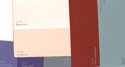
In this case the show is The Whipping Man in Fort Worth, but I choose the base colors here in Dallas at my local Lowe's, from the Olympic brand paint chips.

Olympic paint colors from Lowe's


The creams and tans will be the "white" of classical columns and the darker "stone" floor.  The mahogany color will be for the faux mahogany (eventually plus wood graining and TLC).  The green subs for wallpaper, and the purples for a distant view of destroyed Richmond, Virginia.  (Post with set elevation HERE.)

Odds are my painter will buy some colors of paint and mix others from the theater's stock.  Unless for a special effect, paints are normally flat latex.

Tuesday, March 6, 2012

Funny Projects

Today's funny project is to go to Kitchen Dog and paint a couple of those big billboard-like pictures with the faces cut out so that folks can get silly pictures taken... fun!

(Mind you, human figures are not my thing, so these photos may come out even sillier than they should.)

Here's one of my inspirational photos...  These are public domain photos - amalgamated and generally messed with and neither tidy nor "finished" since this is just a go-by.  My version will be cartoon-y.


The party of the year is Saturday!  Hooch & Pooch at Kitchen Dog Theater!

Monday, March 5, 2012

Book Sale

A new sale from Lulu.com on Alice Through the Proscenium (and a few other books).  More on Alice HERE:

Film Fest - This Means War

This Means War is a light-weight but mildly amusing combo of buddy movie and rom-com. This spies-who-fall-for-the-same-girl flick works only on the strength of the three stars' charm: Reese Witherspoon, Chris Pine, and Tom Hardy.  I did enjoy it...

But why can no one make a pure romantic comedy right now?

This Means War film

Is love not love without a car chase?  Or a Crude Best Friend?  (This time the girl's best friend and well done, if it had to be.)  But as soon as I left the theater I started mentally refilming this story as it might have been in the '40s or '50s with Cary Grant or Rock Hudson as the American spy, maybe David Niven as the Brit... Grace Kelly?  Audrey Hepburn?  The plot of many earlier films were at least as silly, but then the story played out with that era's wit, style, elegance! Spies require derring do, yes, (the paintball fight was fun), but how about an adult story with less of that checklist of 14 year old boy gotta-haves?

If Doctor Zhivago were made today, it'd look like Mission Impossible!

Saturday, March 3, 2012

Film Fest - Loy and Powell

On a bit of a Myrna Loy/William Powell kick around here!  Just watched I Love You Again - amnesia has never been so much fun.  I loved Powell's character's reaction to waking to find a stuffed squirrel staring at him from his bedside.

William, Myrna, and a Squirrel - not from the film, but funny.  More at Film Noire Photos

I'd recommend starting out with that classic The Thin Man, then if you enjoy their chemistry, explore that film's several sequels and then others like Double Wedding.  (Earlier POST.)

HERE's a good review for The Thin Man.

Friday, March 2, 2012

Further Adventures of a Plan

After meeting with the director of Boeing, Boeing (earlier POST), the plan for the set as it will appear in its new theater venue will be slightly revised: two doors will be switched, the bathroom and a bedroom changing places (which means I need to erase "To Bedroom # 2" and write "To Bathroom" basically) and the wall that holds that bedroom door needs to slide onstage a foot or two in order to ease a slight sight-line issue from a few seats.  (There's always a sight-line issue!)

Oh, and the fake Warhol painting morphs into a fake Mondrian.

A Warhol soup can and a Mondrian - both, I believe public domain

Today's task is to revise this sketch and get copies to the theater so the Artistic Director and Technical director can look 'em over.

Thursday, March 1, 2012

Fantastic Theater Set!

Surfing around I just splashed across this spendorific trailer-trashy theater set.  Wish I knew who designed it.

More photos at Sonyradio.com

Apparently this photo has been floating around the internet under the alias of "The Redneck Mansion."  It's actually a set for a production of Ivanov at Amsterdam's Openluchttheater.  Wonderful!

Ongoing Doodles

Sitting in a coffee shop, sipping a latte, doodling on a long-running daydream project...  Isn't a morning off wonderful?  

(Meanwhile a heap of urgent work waits for me on my drafting board.)